Styling the Notes Application#
Aesthetically, our current application is very barebones. As pretty applications are more fun to use, we can do a little something about that. In this case we’ll be sticking to an old skool way of styling.
In other words, we’ll sprinkle some CSS classes around and then apply CSS selectors based on those. The Styling React chapter discusses various other approaches in greater detail.
Styling “Add Note” Button#
To style the “Add Note” button we’ll need to attach a class to it first:
app/components/App.jsx
...

export default class App extends React.Component {
  constructor(props) {
    ...
  }
  render() {
    const {notes} = this.state;

    return (
      <div>
        <button onClick={this.addNote}>+</button>
        <button className="add-note" onClick={this.addNote}>+</button>
        <Notes
          notes={notes}
          onNoteClick={this.activateNoteEdit}
          onEdit={this.editNote}
          onDelete={this.deleteNote}
          />
      </div>
    );
  }
  ...
}
We also need to add corresponding styling:
app/main.css
...

.add-note {
  background-color: #fdfdfd;

  border: 1px solid #ccc;
}
A more general way to handle this would be to set up a Button component and style it. That would give us nicely styled buttons across the application.
Styling Notes#
Currently the Notes list looks a little rough. We can improve that by hiding the list specific styling. We can also fix Notes width so if the user enter a long task, our user interface still remains fixed to some maximum width. A good first step is to attach some classes to Notes so it’s easier to style:
app/components/Notes.jsx
import React from 'react';
import Note from './Note';
import Editable from './Editable';

export default ({
  notes,
  onNoteClick=() => {}, onEdit=() => {}, onDelete=() => {}
}) => (
  <ul>{notes.map(({id, editing, task}) =>
  <ul className="notes">{notes.map(({id, editing, task}) =>
    <li key={id}>
      <Note onClick={onNoteClick.bind(null, id)}>
      <Note className="note" onClick={onNoteClick.bind(null, id)}>
        <Editable
          className="editable"
          editing={editing}
          value={task}
          onEdit={onEdit.bind(null, id)} />
        <button onClick={onDelete.bind(null, id)}>x</button>
        <button
          className="delete"
          onClick={onDelete.bind(null, id)}>x</button>
      </Note>
    </li>
  )}</ul>
)
In order to eliminate the list specific styling, we can apply rules like these:
app/main.css
...

.notes {
  margin: 0.5em;
  padding-left: 0;

  max-width: 10em;
  list-style: none;
}
Styling Individual Notes#
There is still Note related portions left to style. Before attaching any rules, we should make sure we have good styling hooks on Editable:
app/components/Editable.jsx
import React from 'react';
import classnames from 'classnames';

export default ({editing, value, onEdit, ...props}) => {
export default ({editing, value, onEdit, className, ...props}) => {
  if(editing) {
    return <Edit value={value} onEdit={onEdit} {...props} />;
    return <Edit
      className={className}
      value={value}
      onEdit={onEdit}
      {...props} />;
  }

  return <span {...props}>{value}</span>;
  return <span className={classnames('value', className)} {...props}>
    {value}
  </span>;
}

class Edit extends React.Component {
  render() {
    const {value, onEdit, ...props} = this.props;
    const {className, value, onEdit, ...props} = this.props;

    return <input
      type="text"
leanpub-start-insert
      className={classnames('edit', className)}
leanpub-end-insert
      autoFocus={true}
      defaultValue={value}
      onBlur={this.finishEdit}
      onKeyPress={this.checkEnter}
      {...props} />;
  }
  ...
}
Given className accepts only a string, it can be difficult to work with when you have multiple classes depending on some logic. This is where a package known as classnames↗ can be useful. It accepts almost arbitrary input and converts that to a string solving the problem.
There are enough classes to style the remainder now. We can show a shadow below the hovered note. It’s also a good touch to show the delete control on hover as well. Unfortunately this won’t work on touch based interfaces, but it’s good enough for this demo:
app/main.css
...

.note {
  overflow: auto;

  margin-bottom: 0.5em;
  padding: 0.5em;

  background-color: #fdfdfd;
  box-shadow: 0 0 0.3em .03em rgba(0,0,0,.3);
}
.note:hover {
  box-shadow: 0 0 0.3em .03em rgba(0,0,0,.7);

  transition: .6s;
}

.note .value {
  /* force to use inline-block so that it gets minimum height */
  display: inline-block;
}

.note .editable {
  float: left;
}
.note .delete {
  float: right;

  padding: 0;

  background-color: #fdfdfd;
  border: none;

  cursor: pointer;

  visibility: hidden;
}
.note:hover .delete {
  visibility: visible;
}
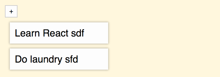
Assuming everything went fine, your application should look roughly like this now:
Conclusion#
This is only one way to style a React application. Relying on classes like this will become problematic as the scale of your application grows. That is why there are alternative ways to style that address this particular problem. The Styling React chapter touches a lot of those techniques.
It can be a good idea to try out a couple of alternative ways to find something you are comfortable with. Particularly CSS Modules are promising as they solve the fundamental problem of CSS - the problem of globals. The technique allows styling locally per component. That happens to fit React very well since we are dealing with components by default.
Now that we have a simple Notes application up and running, we can begin to generalize it into a full blown Kanban. It will take some patience as we’ll need to improve the way we are dealing with the application state. We also need to add some missing structure and make sure it’s possible to drag and drop things around. Those are good goals for the next part of the book.